Posts

Rotoscope

Image
Rocky Rotoscope   For this assignment I took inspiration from Philly again. I traced the infamous scene of Rocky Balboa running up the Philadelphia Art Museum steps. The arms up image is what makes the scene recognizable. Small details seemed unimportant in getting the story across because it is easily recognizable. It was time consuming to trace over the scene but the final product made it worth it.

Lyrical Poster

Image
 Inspiration  Image Process:          Final Product: My lyrical poster is based off of Chris Stapleton's "Tennessee Whiskey" During this project, I aimed to use colors that conveyed the musket and sweetness of the lyrics. To accomplish this I had to alternate the colors throughout. This can be seen by the first colors that were used in the strawberry image, in comparison to it in the final product.

Self- Insertion

Image
 Photo Materials Final Product: For the self-insertion assignment, I decided to photoshop myself into a Parisian setting. The image of myself (bottom right) was taken in Germany, so I wanted to keep the theme of both images being outside the US. These particular images also follow a similar color theme and light source within them. Having people in the second reference photo made it easier for me to keep my size realistic in comparison. 

Complex Illustration

Image
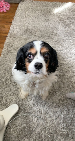
Reference Photo: Final Image: Not only are my favorite animals dogs, but specifically my dog, Vanessa. In this, my aim was to show her tricolors and levels of them. The goal was to cut out any background objects or various colors and stick to the dog specifically, having her as the main focal point.  

Exquisite Corpse

Image
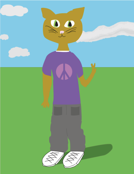
 Final product The peace cat design  was a class chosen image. Because of this each student had the ability to personalize it as they wish. I decided to have the cat stick to an unrealistic look along with a clean background, having the most detail in the shadow and cloud. The idea of a fictional cat who wears clothes and holds up a peace sign affected my color choices. I wanted to keep with the  lighthearted and cheerful colors but also have them make sense in a real world scenario.  Design process:

Caligramme Design

Image
In this design I chose to represent the city of Philadelphia through one of its main symbols, the Liberty Bell. The key text that I wanted to highlight was Philadelphia its self, and second, the saying "City of brotherly love" which is one thing the city is known for. I chose to write "love" in red due to the love sign that stands in the middle of the city. Also, I wanted to keep an overall neat design by focusing primarily on the outline of the bell.